A complete brand identity checklist and step-by-step guide: strategy, logo, colours, typography, voice, imagery and brand guidelines, with a process, worksheets, pros and cons and an interactive checklist.
What is brand identity, and how is it different from a logo?
Many new businesses start with a logo and stop there. Your brand is how people think and feel about your business. Your brand identity is the set of visible and verbal elements that express it. Your logo is just one of them. A strong identity makes your business easy to recognise and easy to trust, everywhere customers meet it. This brand identity checklist walks you through twelve things to have in place before you launch or rebrand.
| Term | What it means | Example |
|---|---|---|
| Brand | The perception people hold of your business | Trusted, premium, friendly |
| Brand identity | The visible and verbal system that expresses the brand | Logo, colours, type, imagery, voice |
| Logo | One element of the identity: your mark | A wordmark or symbol |
| Brand guidelines | The rulebook for using the identity | A PDF or web page of rules |
Brand, identity, logo and guidelines are related but not the same thing.
The brand identity pyramid: build from the top down
Good identity is built from the top down. Each layer depends on the one above it, which is why strategy comes before design. Skipping to the logo first is the most common reason identities feel generic.
A simplified model of how a brand identity is built.
The brand identity design process, step by step
- DiscoverResearch your business, customers and competitors
- DefineAgree purpose, audience and positioning
- DesignCreate logo concepts and the visual system
- DocumentWrite guidelines and prepare files
- DeployApply to website, social and print
| Phase | What you do | Deliverables |
|---|---|---|
| Discover | Interviews, competitor review, audience research | Research summary |
| Define | Workshops on purpose, positioning, personality | Brand strategy document |
| Design | Logo concepts, colours, type, imagery | Logo set and visual system |
| Document | Compile rules and examples | Brand guidelines |
| Deploy | Apply across channels | Templates, website, social, print files |
Deliverables you should expect at each phase of a professional identity project.
Part 1: Brand strategy checklist
- 1. PurposeWhy does your business exist beyond making money? Write it in a sentence or two.
- 2. AudienceWho are your best customers, what do they need and what do they care about?
- 3. PositioningWhat do you offer that competitors do not, and how will you say it? This is the single idea your brand stands for.
- 4. Competitor reviewStudy how competitors look and sound, then be different on purpose.
Brand strategy worksheet: questions to answer
- What problem do we solve, and for whom?
- Why would a customer choose us over the alternatives?
- What three words should customers use to describe us?
- What do we never want to be known for?
- Which customer feeling matters most: trust, excitement, comfort, status?
Part 2: Visual identity checklist
- 5. Logo and variationsA primary logo plus versions for small sizes, dark and light backgrounds and social icons.
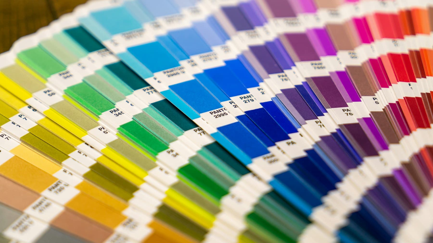
- 6. Colour paletteA small set of primary and supporting colours with exact values for print and screen.
- 7. TypographyOne or two typefaces with clear rules for headings, body text and emphasis.
- 8. Imagery and graphic styleThe photography, illustration, icons and patterns that fit your brand, and what to avoid.
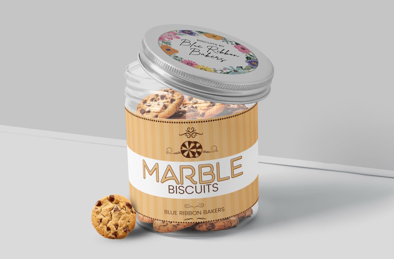
Logo versions every brand needs
| Version | Use |
|---|---|
| Primary logo | Main use on website, documents and signage |
| Secondary or stacked logo | Narrow or square spaces |
| Icon or symbol | Social profile pictures, app icons, favicon |
| One-colour and reversed | Stamps, embossing, dark backgrounds |
Having every version ready prevents bad improvisations later.
How to build a colour palette
- Pick one or two primary coloursThey carry the brand and should reflect your personality.
- Add supporting and neutral coloursUse them for backgrounds, text and accents.
- Record exact valuesNote HEX and RGB for screens and CMYK or Pantone for print.
- Test contrastWCAG recommends a contrast ratio of at least 4.5:1 for normal text and 3:1 for large text so people can read it.
Typography and imagery rules
Typography do
- Use one or two typefaces
- Set a clear heading and body hierarchy
- Check font licences for web and print
- Choose readable sizes on mobile
Typography avoid
- Mixing many fonts
- Decorative fonts for body text
- Unlicensed fonts
- Tiny low-contrast text
Part 3: Verbal identity and tone of voice
- 9. Name and taglineA name that is easy to say, spell and search, and a tagline only if it adds meaning.
- 10. Tone of voicePick three to five words that describe how you sound, with examples of how you would and would not say things.
| We are | We are not | Example |
|---|---|---|
| Clear | Jargon-heavy | We build websites that load fast, not websites that impress other agencies. |
| Warm | Cold or corporate | Tell us about your business. We will take it from there. |
| Confident | Boastful | We show results instead of claiming to be the best. |
A simple voice chart. Fill in your own three words.
Part 4: Apply your identity and write brand guidelines
An identity only works when it is applied consistently. Before launch, apply it to every place customers will meet you:
- Website
- Social profiles
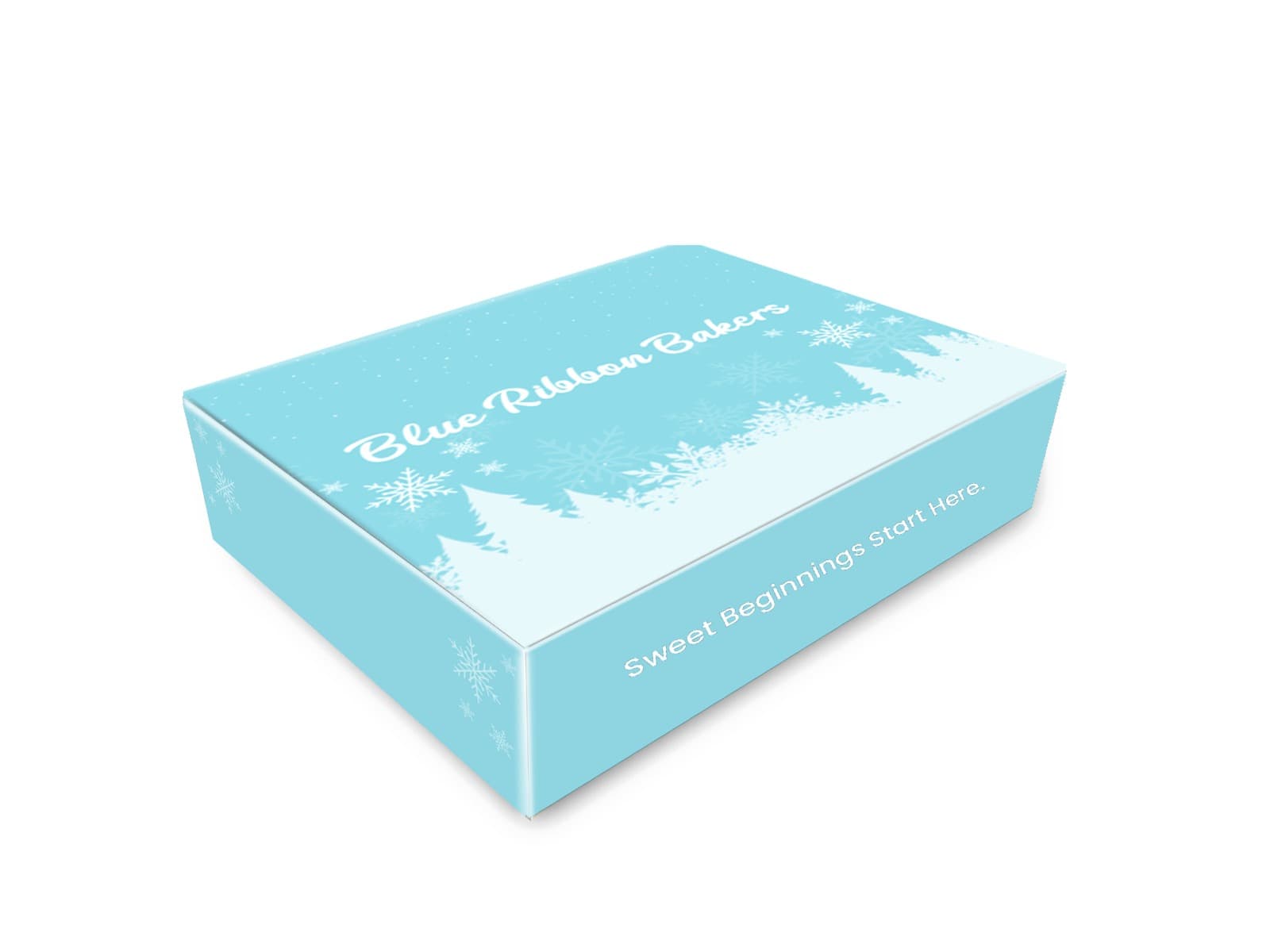
- Packaging
- Stationery
- Signage
- Ads and templates
- 11. ApplicationsApply the identity to the touchpoints above so everything is consistent from day one.
- 12. Brand guidelinesA short document recording all of the above so anyone who works with you can stay on brand.
What to include in brand guidelines
| Section | What it covers |
|---|---|
| Brand story | Purpose, positioning and personality |
| Logo | Versions, clear space, minimum size, what not to do |
| Colour | Palette with exact values and usage ratios |
| Typography | Typefaces, sizes and hierarchy |
| Imagery | Photo and graphic style with examples |
| Voice | Tone, vocabulary and examples |
| Applications | Templates for social, print and web |
A practical outline for a brand guidelines document.
Your interactive brand identity checklist
Brand identity checklist
0 / 12Tick off what you already have. The open items show exactly where your brand is weakest.
How to do this
Finish the sentence: we exist to help [who] achieve [what] by [how]. If it needs a paragraph, it is not clear yet.
How to do this
Describe one real customer: age range, what they need, what they worry about, where they spend time. Avoid saying everyone.
How to do this
Write one sentence: for [audience], we are the [category] that [main benefit], unlike [alternative]. Get the owners to agree on it.
How to do this
List five direct competitors. Note their name, logo style, colours and promise. Look for what none of them own.
How to do this
You need a main logo, a one-colour version, a small icon version and a horizontal and stacked layout. Save them as SVG and PNG.
How to do this
Pick two to four colours and record the exact HEX value of each. Decide which is the main colour and which is the accent.
How to do this
Choose one heading font and one body font. Write down sizes and weights so everyone sets text the same way.
How to do this
Decide what your photos look like (real, studio, lifestyle) and what graphic shapes or icons you use. Collect examples.
How to do this
Check the name is not already in use and the handles and domain are free. Write one tagline of eight words or fewer.
How to do this
Pick three personality words, then write two sample sentences that sound like you and two that do not.
How to do this
Check your website, social profiles, packaging, invoices, email signature and signage all use the same logo, colours and fonts.
How to do this
Put everything above in one document or PDF that a new designer or printer could follow without asking you.
Early stage. Start with the first open item and work down.
Not sure where your brand stands? We will review it and tell you what to fix first.
Get a free brand reviewYour ticks are saved in this browser only. Nothing is sent anywhere.
DIY branding or hire a professional?
DIY branding
- Lower upfront cost
- Full control
- Quick for a very simple start
- Strategy is often skipped
- Hard to stay consistent
- Risk of a generic or dated look
Professional branding
- Strategy-led and distinctive
- A complete, consistent system
- Guidelines for the whole team
- Higher cost
- Needs clear feedback from you
Common brand identity mistakes to avoid
Mistakes
- Copying competitors
- Skipping strategy and going straight to a logo
- Using different colours and fonts across channels
- Too many colours and typefaces
- No guidelines, so the identity drifts
Better approach
- Differentiate on purpose
- Define positioning first
- One system used everywhere
- A small, disciplined palette
- A written guide anyone can follow
Need help building the whole system? See our branding service, or the strategy work behind it in creative strategy. Once your identity is ready, it should carry through to your website and social media.
Frequently asked questions
What should a brand identity include?
Strategy (purpose, audience, positioning), visual identity (logo, colours, typography, imagery), verbal identity (name, tagline, voice) and guidelines for applying it.
How long does a brand identity take to create?
It depends on scope. A clear brief and quick feedback make the process faster.
Can I do my branding myself?
You can, but strategy and consistency are where most DIY attempts struggle. A professional can help you avoid costly rework.
When should I rebrand?
When your business or audience has changed, or your look no longer reflects the quality of what you do.
Do I need brand guidelines if I am small?
Yes. Even a simple guide keeps your brand consistent as you grow and as more people work with it.
What is the difference between branding and marketing?
Branding defines who you are and how you are perceived. Marketing is how you promote and sell. Strong branding makes marketing more effective.
How many colours and fonts should a brand use?
Usually one or two primary colours with supporting neutrals, and one or two typefaces. Simpler systems are easier to use consistently.
What file formats should I receive for my logo?
Vector files such as SVG, PDF or AI for scaling, plus PNG for screens, in colour, one-colour and reversed versions.
Need help with branding?
Brand strategy, logo and visual identity, and brand guidelines that make your business memorable. Branding agency serving Karachi, Pakistan and Doha, Qatar.

Novtex Global is a branding, web development and performance marketing agency with offices in Karachi and Doha. Read more about us.